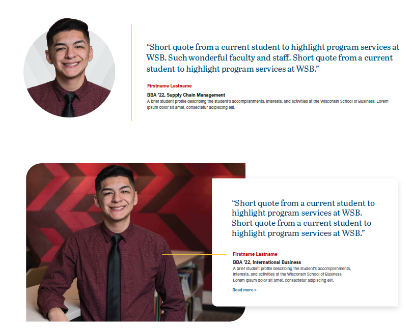
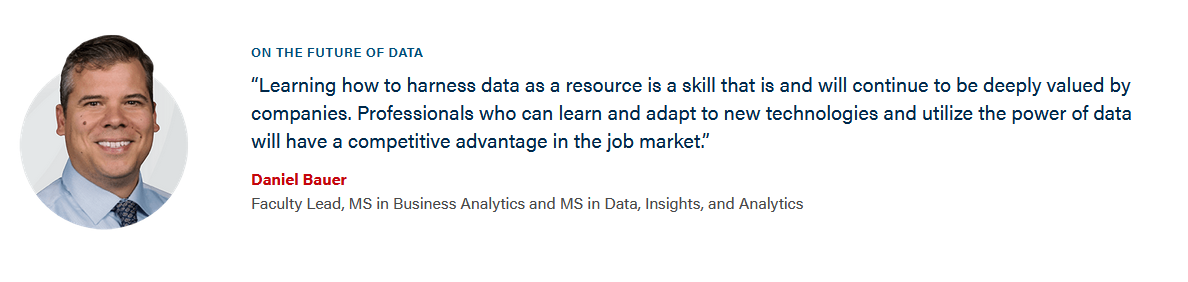
Also known as: quote with image, person testimonial
Description
A block that displays one or more testimonials/quotes from students, alumni, faculty, staff, or corporate partners. Can be displayed in a swiper with up to 10 testimonials total.
Design
Anatomy
Standard Layout
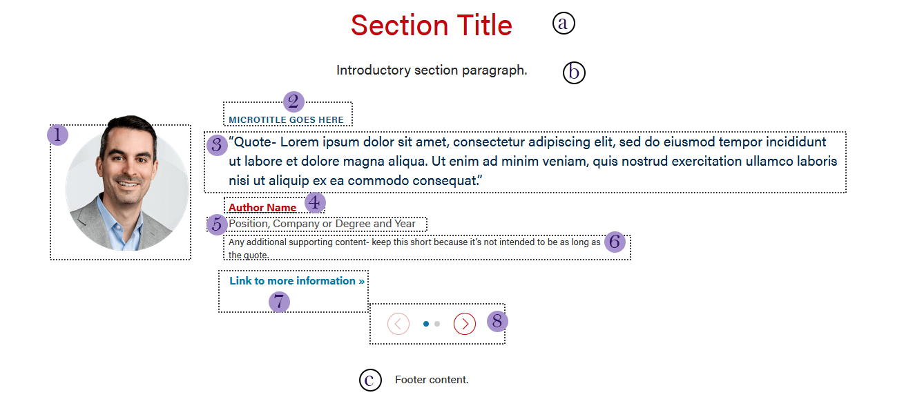
Note: all of these fields are technically optional, and in most cases you should not use all of them simultaneously.
- Image
Photo of the person being quoted. The photo should have the "circle crop treatment" - ask a designer to edit the headshot if there isn't one already. Simply cropping to a circle is okay for articles, but on webpages it should always have this treatment. - Title/Microtitle (optional)
60 characters or less. Automatically gets styled to uppercase- please still use sentence case when entering into the field. - Quote (optional, but recommended)
The quote. Do not include quotation marks, those are added automatically. Try to keep under 4 lines (~400 characters including spaces, or ~50 words). - Author and Author Link
- Author (optional, but recommended) - the name of the person, plus their grad year, if appropriate. Do not use a dash in front of the name.
- Author Link (optional) - This field appears after you add the Author's name. The URL to their profile, spotlight, etc.
- Position/Title (optional)
"Position, Company" or their degree program or other important info. - Supporting Content (optional)
Any other additional info- keep this short. Text wraps to a new line after 80-90 characters. Keep under ~160 characters (~25 words) - Link (optional)
Link to relevant article, page, etc. - Swiper (optional)
If there is more than one testimonial in a block, a swiper will appear. You can turn off the swiper by checking the "Stack Testimonials" option in Configuration, which will stack the testimonials on top of each other instead.
Intro/Footer Fields
Most blocks come with an optional section title/header (a), an intro paragraph (b), a footer (c) and footer link (not pictured). Use these as needed. Many uses of testimonials do not include any of them.
Full-width Layout
An alternative version of the testimonial is available for quotes that are especially impactful. Currently, the full-width layout only supports the use of one testimonial and does not come with a swiper.
The Full-width Layout can be selected under "Layout" in configuration. The option disappears if there is more than 1 testimonial card.
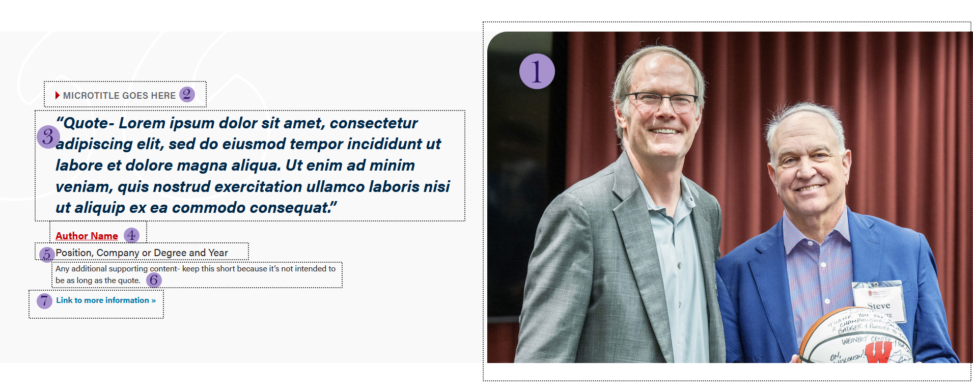
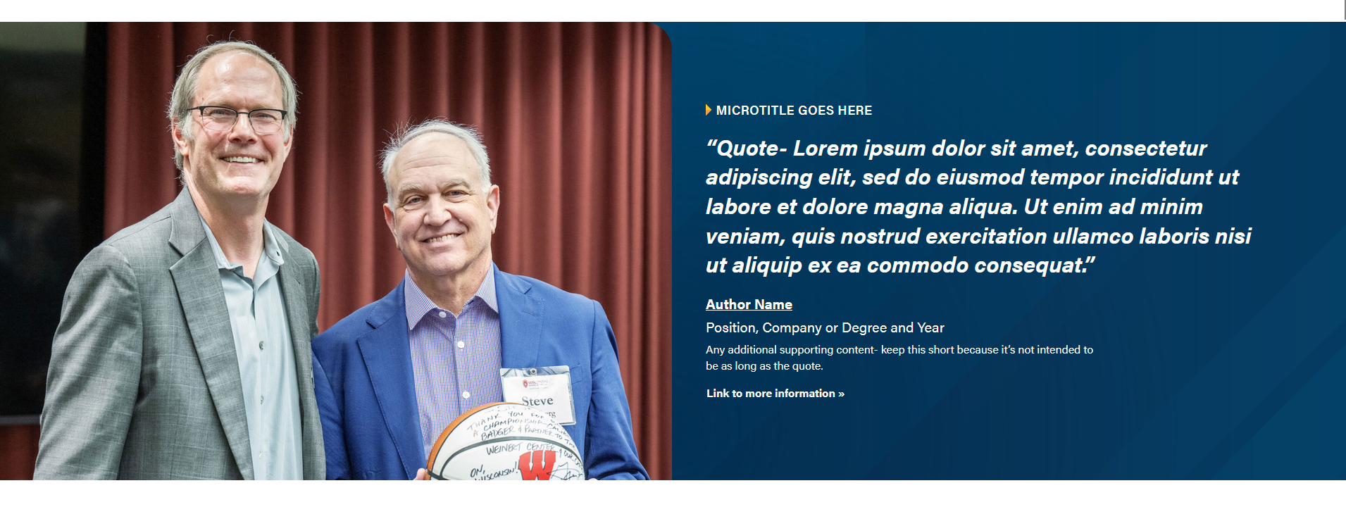
1. Image (optional but recommended)
- Photo of the person being quoted in action. Photo needs to be large and high quality- at least 1536px wide because it will take up half the screen on desktop sizes.
- Note that the width:height ratio will determine the height of the block- the taller the photo, the more padding added around the text.
- The image can be on the left or right side of the block. This option is available in Configuration.
- The full-width testimonial can be used without an image, but should be done so sparingly.
2-7. Same as Standard Layout above, except copy/character count should be as short as possible since the font sizes are all bigger.
Note that there is not 8 (Swiper) because you can only have one testimonial in the full-width version.
Intro/Footer Fields
Do not use the intro or footer sections for the full-width layout!
Use When
- Displaying an impactful testimonial from a student/alumni
- Spotlighting faculty/staff
- Displaying a testimonial from a corporate partner/business. You can use a photo of the person, or the logo of the business.
- Linking to a profile/spotlight
- (less common) Displaying bio information about faculty/staff, typically how they can support students.
Design Assets Needed
Images
Standard Layout- Circle Crop headshot
- Dimensions: ~512x569px
- Ask designers to do the circle crop treatment to a headshot.
Company logos can just be placed as is.
Full-width Layout
- Dimensions: 1536px wide by any height
- Note that the width:height ratio will affect the height of the block. The taller the image relative to the width, the taller the block.
Implementation
ACF Fields
See Anatomy section, above, for the list of fields.
Resources
Dev Notes
Previously known as "Testimonial - Person", the Testimonial block is used for both individual and company testimonials. The "name" field in the block.json file for the testimonial block remains "acf/testimonial-person" in order to prevent the breaking of existing blocks.
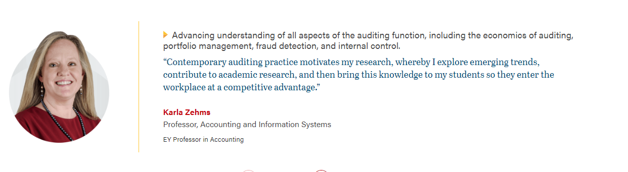
Old design (updated 6/2026)
Removed Features
The "Overlap" and "Stretch Link" options have been removed as of 4/3/24. To get the "overlap" effect, use a horizontal card instead.