Also known as: card next to photo, overlap card, copy beside photo
Description
A layout that displays a large photo next to a small amount of copy.
| Expand | ||||
|---|---|---|---|---|
| ||||
|
Design


Use When
- Displaying a small amount of copy with a high-quality photo
- We typically display 1-3 cards, either stacked on the page or in a swiper
- Each card requires a photo
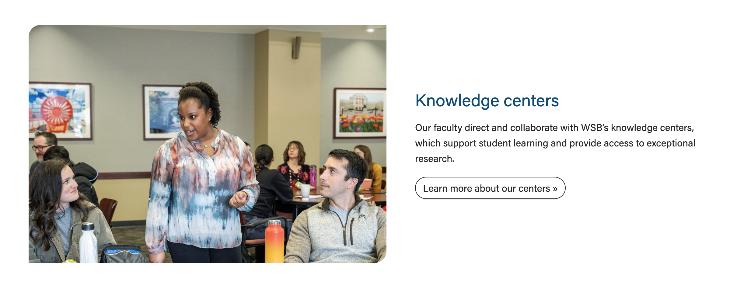
- Introducing a topic on a landing page and linking to a subpage with more information (example: Knowledge Centers card on the Faculty & Research page)
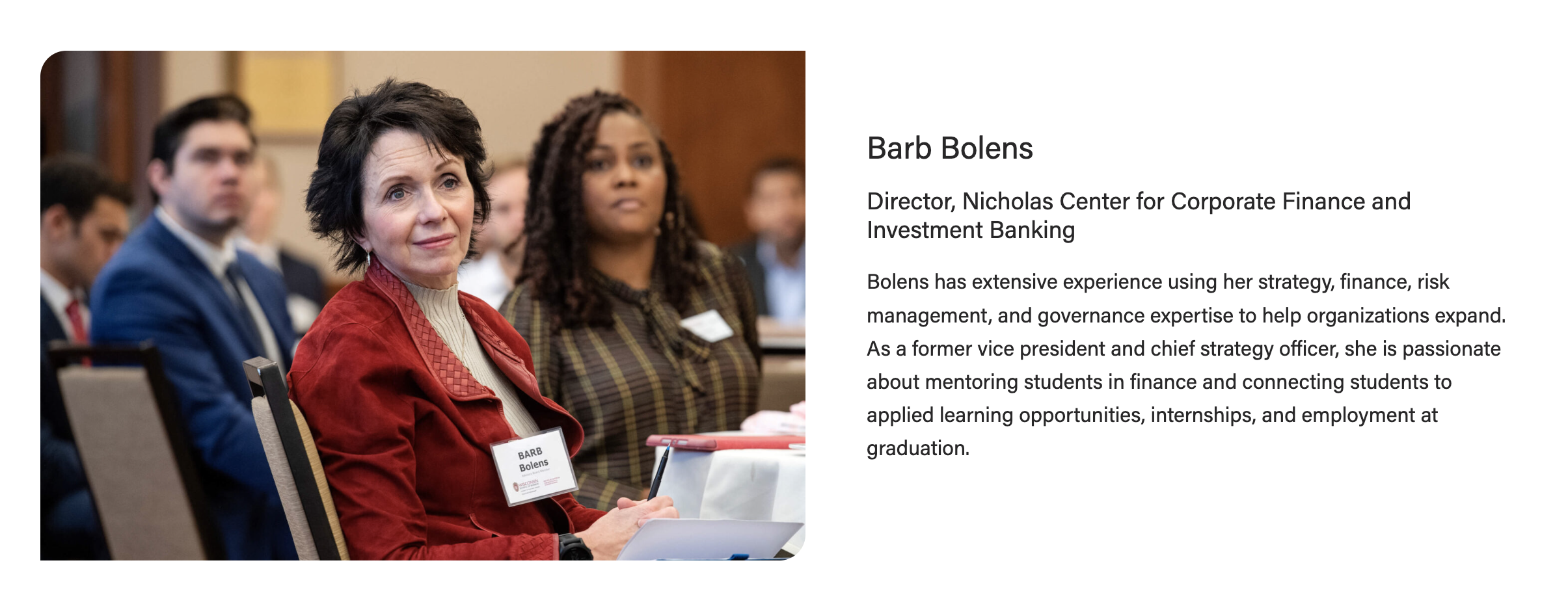
- Spotlighting a board member or center leader on a program page (example: "Faculty and leadership spotlights" on the MBA in Corporate Finance page)
Editorial Guidelines
Follow our general Web Copy General Guidelines in addition to the following:
General
- Cards in a swiper should have similar amounts of content so the height of the card doesn't change drastically when the user navigates to a different card.
- This means card titles of similar length and card content of similar length.
Card micro-title (optional)
- Small label displayed above the card title that provides a bit of context, such as a news category
- Not used often in this block
Card title/heading (recommended)
- Keep the heading limited to one short phrase
- Character limit: ~30 characters
- Heading level will be set to match the content hierarchy; these are typically h2, h3, or h4
Subtitle (optional)
- Not used often in this block
- Example: Leadership spotlights on MBA in Corporate Finance page
- "Director, Nicholas Center..." is the subtitle in the screenshot below
Supporting content (recommended)
- Paragraph copy and/or a bulleted list
- Character limit: ~300 characters
- The copy should never extend above/below the photo on desktop. The developer will ask the writer to trim copy if we see that happening.
Link/button (optional)
- Provide URL and desired link text
- If the link text essentially repeats the card title, the button can be hidden and we can link the card heading instead
Design Assets Needed
Card photo (required)
- Standard horizontal photo; use a portrait or environmental shot
- Dimensions: 2400x1600px
- jpeg file
Implementation
Layout options
- To choose a layout, open the card configuration accordion and select an option under Image Width
Design
Component Library
Screenshot

Use Cases
...
- .
33/66 layout (use sparingly)
- Only use this layout when you have a small amount of copy (< 250 characters total). Too much copy will break the layout (the card will extend above and below the image), so test the block with the content in it at every breakpoint (screen size).
- You can also use this layout when the image is not as important or does not have small details that are important to see.
To create this layout, open the card configuration accordion and select 33/66 under Image Width.
50/50 layout (default)
- This layout can be used anytime you need an image next to copy. This is the default layout of the block.
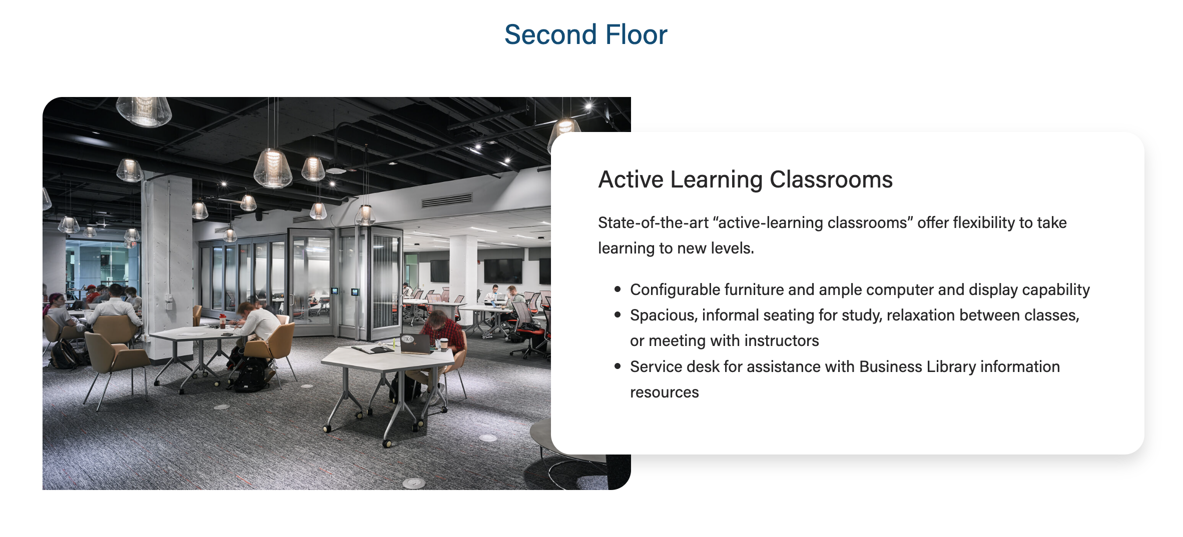
50/50 layout with overlap (use sometimes)
- This layout can be used anytime you need an image next to short or medium length copy
...
- (< 300 characters)
- To use this layout, toggle the Overlap Text field ON in the block configuration.
- Important: The text box should never extend above and below the image next to it; if it does, use the 50/50 layout with no overlap instead.
- Here is an example when to not use overlap for this card:
ACF Fields
Card-level Fields
Populate from post
- Use this to dynamically pull in an existing blog, news, or spotlight post to fill the block. You won't be able to fill out the other fields once you select a post in this field.
Populate from spotlight
- Use this to dynamically pull in an existing spotlight post to fill the block. You won't be able to fill out the other fields once you select a post in this field.
- You will need to update the excerpt in the spotlight to have the person's name (degree 'year) in bold (use <b> tags).
- You will need to add the link to the spotlight and the text read "Read
...
- (first name)'s story".
Title
- The card title.
...
- This field is not required but is typically used
Heading Size
- You can select H2 - H4 heading sizes.
Subtitle
- The card subtitle.
...
- A heading element that will be set one heading level down from the card heading size.
Image
- Use large, high-quality images that are 2400 x 1600
...
- .
- Slightly smaller images may also work, but be sure to test thoroughly.
Image Alignment
...
- Place the image
...
- on the left or right side of the
...
- copy.
Micro-title
- The card micro-title.
Content
- The card supporting copy. This should not be more than 1 paragraph or
...
- ~300 characters.
- Make sure the amount of copy in the card looks good. The copy should never extend above/below the image.
...
- If the copy length doesn't meet our standard, cut some of it or ask a writer to cut some of it.
Link
...
- Add the URL and appropriate link text.
CTA Styles
...
- Default style is a text link or choose a different CTA
...
- style
- Options:
- text link
- primary button
- dark outline
- red outline
Block-level Fields
Stretch Link
- The text will
...
- stretch to cover the entire card and adds the raised hover
...
- effect
...
- .
- This should only be used when the card is displaying an outline and shadow (i.e. 33/66 layout or 50/50 layout with Overlap Text ON).
- For right
- now, this field is to be
- used for Update Magazine.
Overlap Text
- The card text will have a shadow and it will overlap the image. NOTE: Only use with the 50/50 layout.
- Use sparingly. If there are lots of other card types on the page with outline and shadow, don't use this feature.
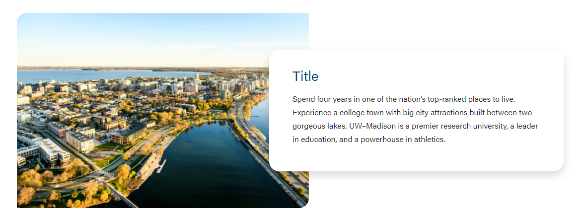
Image Width
You can select the following sizes.
33/66

50/50
 See layout options above for more information
Enable Swiper
If you have multiple cards in one block, you can choose between using a swiper or stacking the cards on the page.