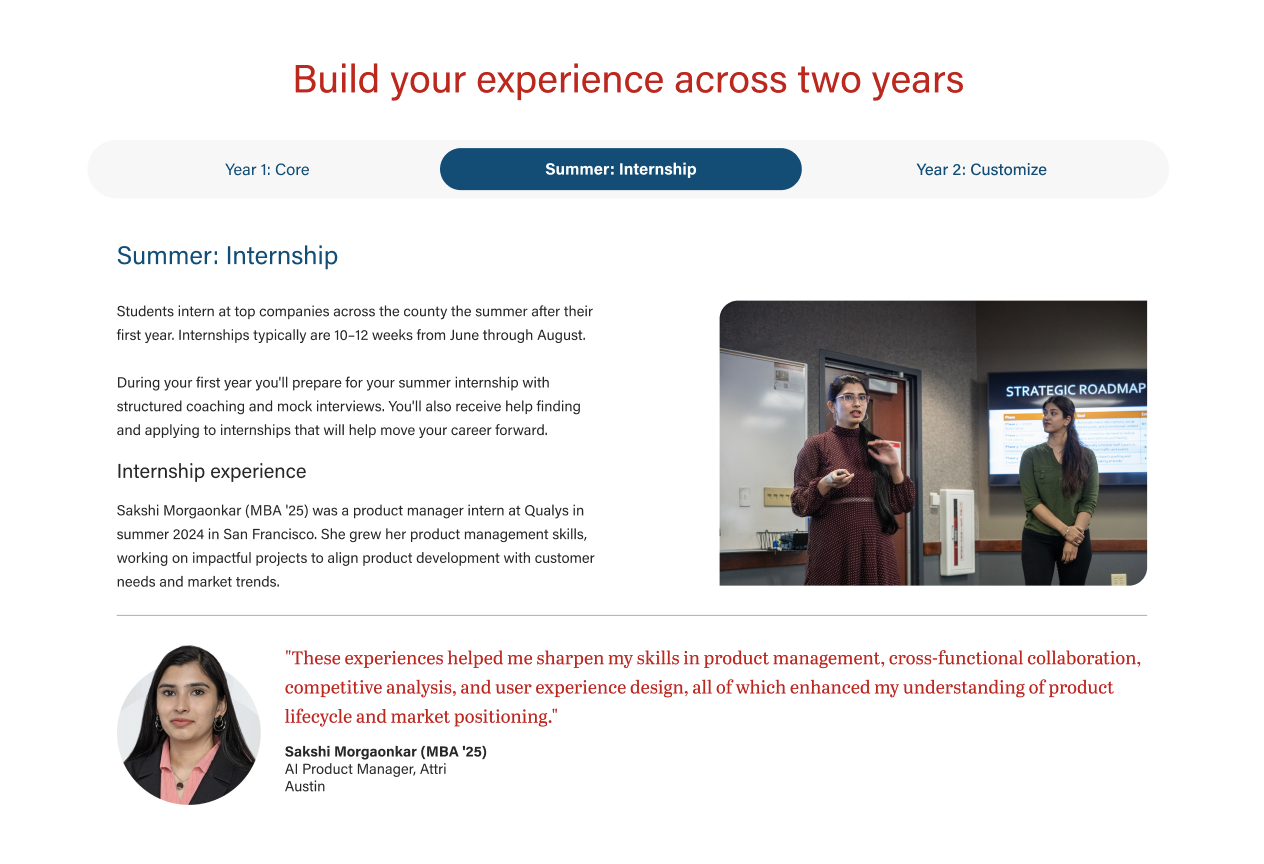
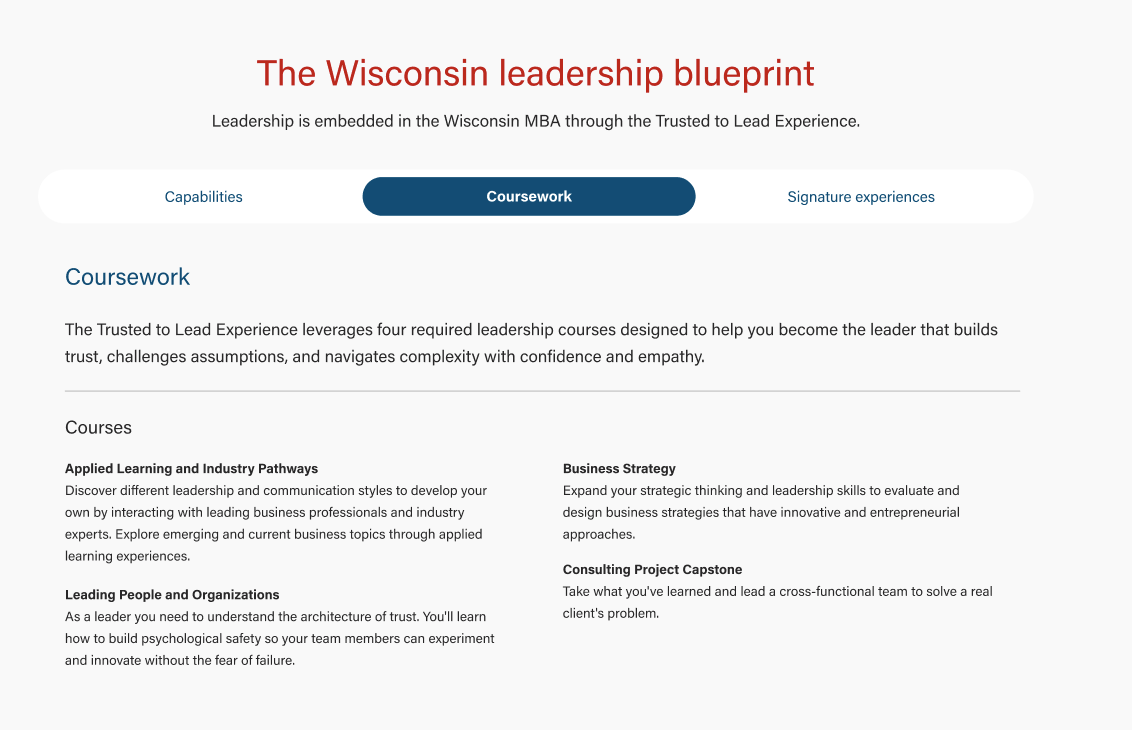
Also known as: tabs, horizontal tabs
Description
Displays 2-5 tabs and when users select one tab, more details are shown. Content is displayed in an accordion on mobile.
| Expand |
|---|
| title | Sections on this page |
|---|
|
|
Design
Use When
- Displaying details about 2-5 categories on a webpage
- You need to display more information than will fit in individual cards
- Adding specific details to a program subpage (e.g. Adding applied learning details to a Curriculum page)
Editorial Guidelines
Follow our general Web Copy General Guidelines in addition to the following:
Tab name (button)
- A short category label that is displayed in each tab button.
- Character limit: 1-2 words, 30 characters for each tab
- If you are including 5 tabs, a developer may request shorter tab labels to ensure the content fits in the layout.
Tab panel (details)
- Each tab will have its own panel with more details.
- Panels in the same tabbed content block should have similar amounts of content for a good user experience.
Panel heading
- On desktop, the tab name will be repeated as the first heading (typically an h3) inside the panel.
- Optional: You can provide a longer heading for the panel if preferred. This heading should mirror or contain information from the tab name for clarity.
- We want this heading to confirm to users that the panel content matches what they expect to see after interacting with a tab button.
Panel content
- Keep copy length reasonable - recommended character limit: 600 characters
- Follow web best practices for keeping content easy to digest and scannable
- Use subheadings if you include more than 2 paragraphs
- Types of content we can include in panels:
- subheadings with supporting copy
- testimonials/quotes with or without headshots
- supporting photos, logos, or graphics
- buttons
Design Assets Needed
Images (optional)
Follow our image standards for horizontal photos, cut-out headshots, logos, etc.
Implementation
ACF Fields
Add/Edit Tabs
Tab name (required)
- Short copy displayed in each tab button, 1-2 words, 30 characters max.
- Be sure to test tab copy in the layout at different window sizes. Ask the copywriter to shorten copy if the layout breaks.
Tab panel heading override (optional)
- Can display a longer heading inside the panel if the tab name is too short for writer's needs
Tab panel content (required)
- Add content to the WYSIWYG field.
- Try to avoid a single column layout for copy, since this creates a long line length and reduces readability.
- Options to try:
- Ask the copywriter to chunk the content and provide subheadings if possible. Then put the content into a 2 or 3 column layout.
- If the content cannot be split into multiple columns, try adding a photo next to the copy.
Formatting panel content
- Use existing classes for styling panel content
- Bootstrap spacing/utility classes (e.g. "mt-4", "px-2", "gx-5")
- WSB shared styles
- Copy code snippets below
Column layouts
- Use Bootstrap "row" and "col" classes to create multi-column layouts
2 Columns - 60% / 40%
| Code Block |
|---|
| language | html |
|---|
| title | Code for 60/40 columns |
|---|
| collapse | true |
|---|
|
<div class="row">
<div class="col-12 col-lg-7 pe-lg-5">
       ADD CONTENT
</div>

<div class="col-12 col-lg-5 mt-4 mt-lg-0">
       ADD CONTENT
</div>
</div> |
3 Columns
| Code Block |
|---|
| language | html |
|---|
| title | Code for 3 column layout |
|---|
| collapse | true |
|---|
|
<div class="row gx-5">
    <div class="col-12 col-lg-4">
       ADD CONTENT
    </div>
    <div class="col-12 col-lg-4">
       ADD CONTENT
    </div>
    <div class="col-12 col-lg-4">
      ADD CONTENT
    </div>
</div> |
Horizontal rule
- Code: <hr class="hr-gray my-4" />
Photo
- Use the add media button to find the image in the media library and it will be added to the WYSIWYG as an <img> element
- Add alt text
- Change the width and height values to fit your layout
- Use WP align classes (alignnone, aligncenter, etc.)
- Add "brand-border-radius" class to round 2 of the image's corners
- Optional: add a container div around the image for additional styling
| Code Block |
|---|
| language | html |
|---|
| title | Example code for photo |
|---|
| collapse | true |
|---|
|
<div class="image mt-4 mt-lg-0 ">
   <img src="https://update-wisc-business.pantheonsite.io/wp-content/uploads/2026/05/RequirED_masthead_2400_1600-512x341.avif" alt="Professor Milt Hwang speaks to a group of students about AI during his class" width="300" height="200" class="aligncenter brand-border-radius size-medium wp-image-166081" />
</div> |
Testimonial/pullquote
- Use "wsb-pullquote" class on a figure element
- Copy one of the code snippets below and add your content
| Code Block |
|---|
| language | html |
|---|
| title | Pullquote w/o headshot |
|---|
| collapse | true |
|---|
|
<figure class="wsb-pullquote text-center col-lg-9 mx-auto my-4">
   <blockquote>"ADD QUOTE"</blockquote>
   <figcaption>
     <p class="author">ADD NAME</p>
     <p>ADD TITLE AND COMPANY</p>
   </figcaption>
</figure> |
| Code Block |
|---|
| language | html |
|---|
| title | Pullquote w/ headshot |
|---|
| collapse | true |
|---|
|
ADD HEADSHOT CODE HERE

<figure class="wsb-pullquote text-center col-lg-9 mx-auto my-4">
   <blockquote>"ADD QUOTE"</blockquote>
   <figcaption>
     <p class="author">ADD NAME</p>
     <p>ADD TITLE AND COMPANY</p>
   </figcaption>
</figure> |
Configuration
Background (optional)
- Options: white or light gray
- Can choose to display a background color on desktop (this background color is not displayed on mobile)
Resources