
...
| Expand | ||||
|---|---|---|---|---|
| ||||
|
Design
Card with no bio, intro text centered
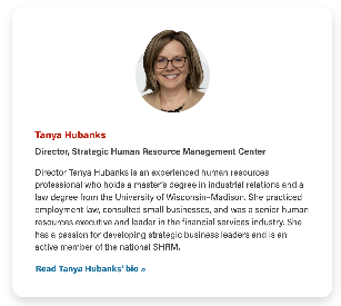
| Card with bio, text left-aligned
|
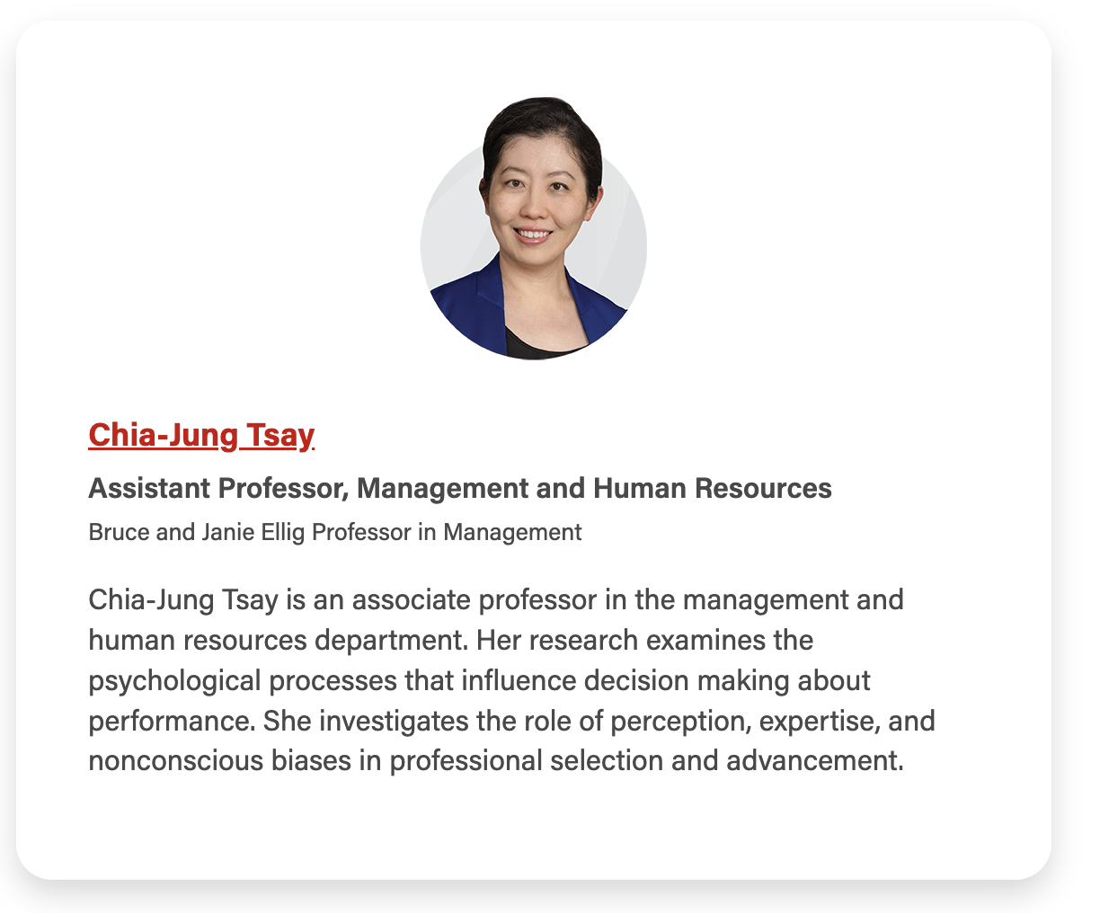
Card with CTA hidden and name linked instead
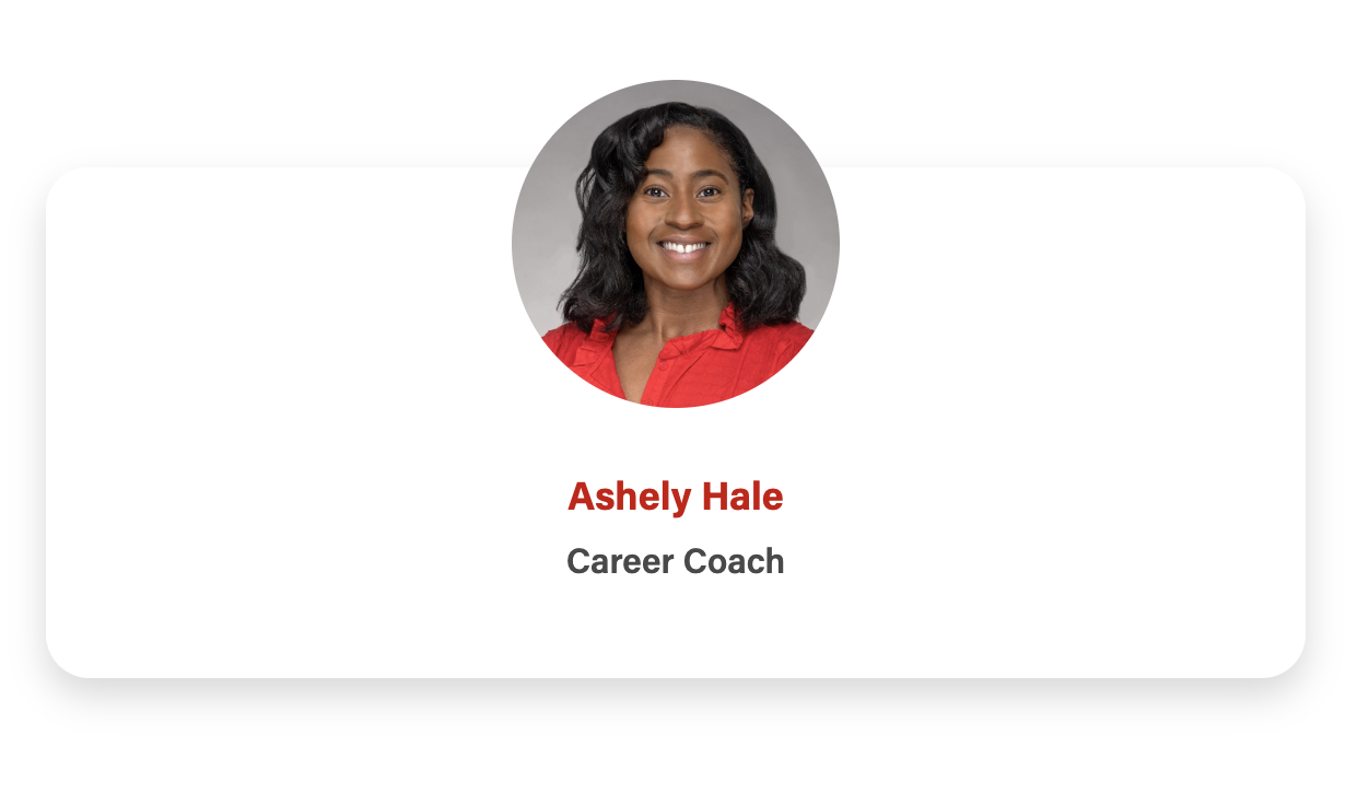
| Card with image overlap
|
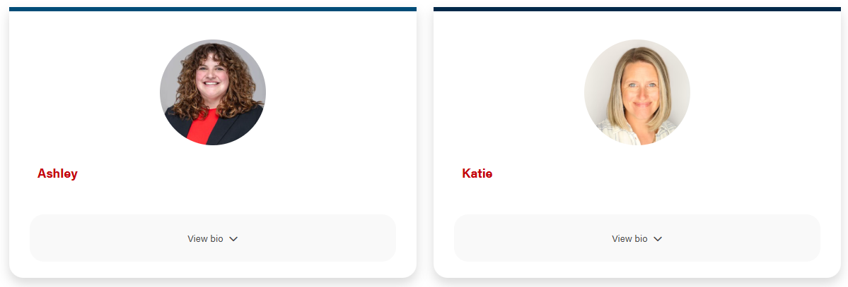
Card with border top
| Card with expanded
|

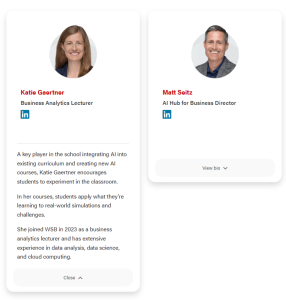
Use When
- Use when you need to add additional information, such as a biography, that isn't found in the directory data.
- This card has been used for displaying guest speakers on event posts and board members on webpages.
...
- This field appears above the email address. If there no other detail is needed, it's fine to leave empty.
- Can use this field for social media icons to be added. You will need to add the following code.
The class="social-media-icon" must be added to the <a> tag for the styles to appear.Code Block title Social Media Icon code collapse true <a class="social-media-icon" href="person's social media link goes here" aria-label="Follow me on LinkedIn"><i class="fab fa-linkedin mt-1 mb-2" aria-hidden="true"></i></a>
Description
- Use for a biography or portfolio. If there is no biography, it's fine to leave empty.
...
- Add a footnote or button(s) below the block.
Configuration
Add border top color to the cards?
- Adds branded blue or dark blue to the top of the cards.
...
- Choose yes or no, default is no.
- Setting this field to true will NOT center text in the main card body, as it is not recommended to center paragraphs of text. If you do need to center the main content, add "text-center" class to Block Wrapper Class(es). You will need to also set this field to yes if you want all text in the cards to be centered.
Show expanded content on cards?
- When checked, a button will appear on the card that will allow for a title and copy to be shown to the user when the user clicks on the the button.
- Hides Enable Swiper and Stretch link fields
- Don't use links in the card footer. If you need to add a link, place it in the card description WYSIWYG
Column Structure
The columns are automatically set at
...