...
| Expand | ||||
|---|---|---|---|---|
| ||||
|
Design
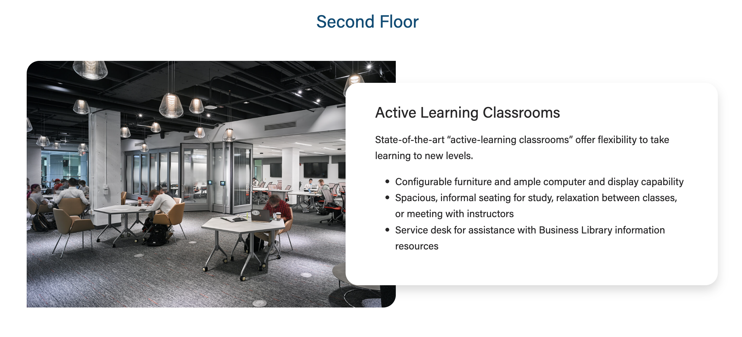

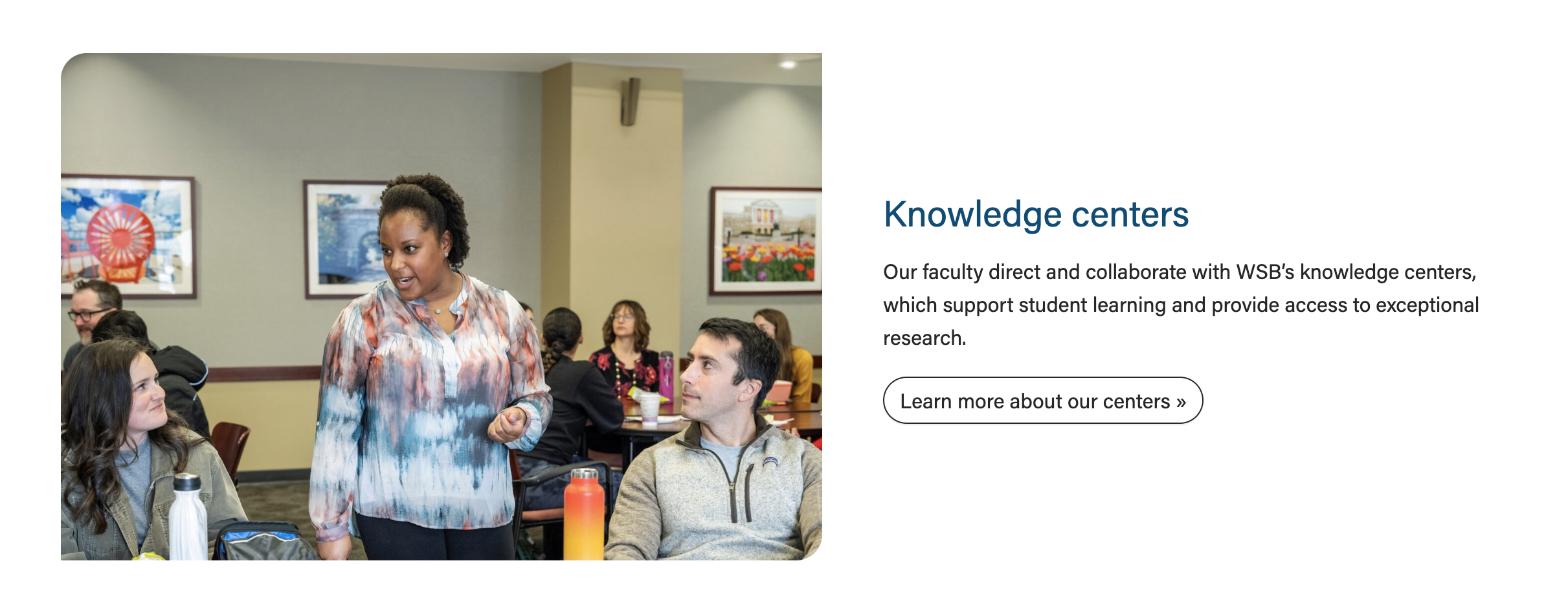

Use When
- Displaying a small amount of copy with a high-quality photo
- We typically display 1-3 cards, either stacked on the page or in a swiper
- Each card requires a photo
- Introducing a topic on a landing page and linking to a subpage with more information (example
- Example: Knowledge Centers card on the Faculty & Research page
- Spotlighting a board member or center leader on a program page (example
- Example: "Faculty and leadership spotlights" on the MBA in Corporate Finance page
Editorial Guidelines
Follow our general Web Copy General Guidelines in addition to the following:
...
- The card supporting copy. This should not be more than 1 paragraph or ~300 characters.
- Make sure the amount of copy in the card looks good. The copy should never extend above/below the image.
- If the copy length doesn't meet our standard, cut some of it or ask a writer to cut some of it.
Link
- Add the URL and appropriate link text.
CTA Styles
- Default style is a text link or choose a different CTA style
- Options:
- text link
- primary button
- dark outline
- red outline
...

Image Width
See layout options above for more information
...