
Also known as: 40/60 layout, 66/33 layout, 45/65, 50/50, text next to card
Description
...
| Expand | ||||
|---|---|---|---|---|
| ||||
|
Design
Desktop
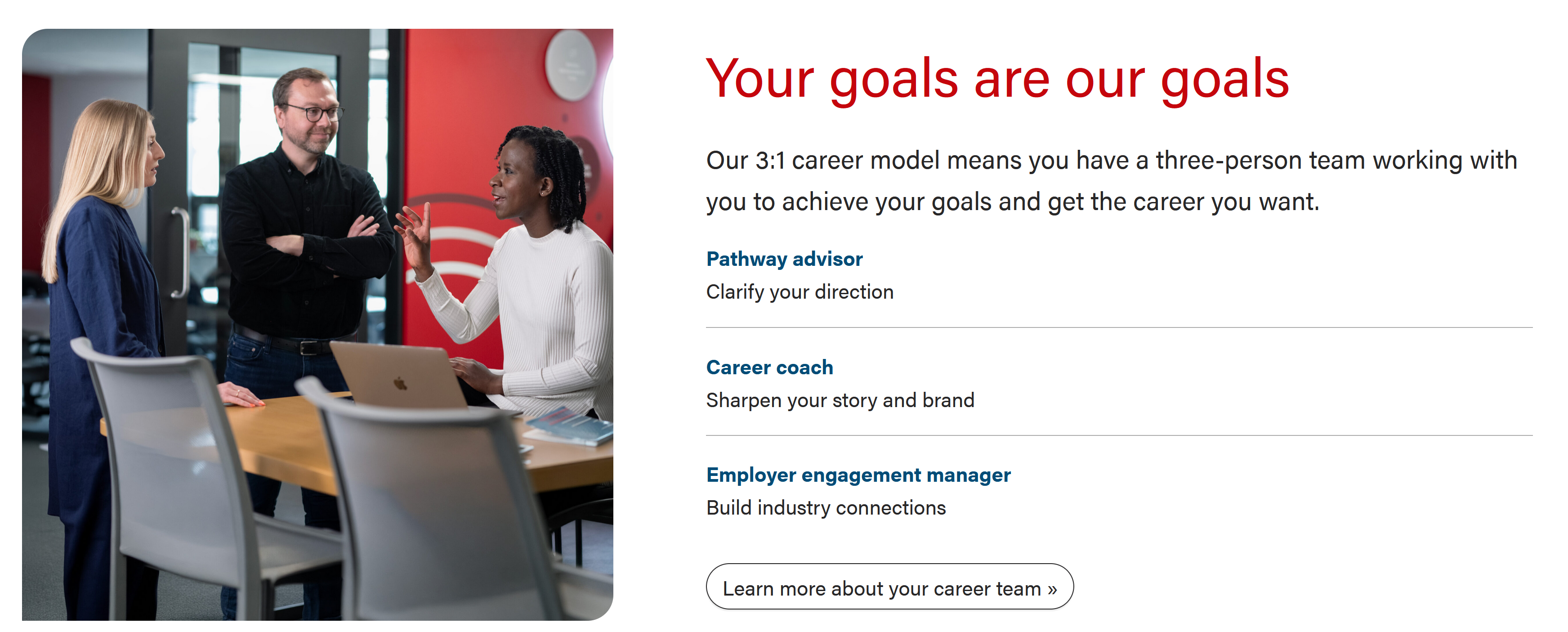
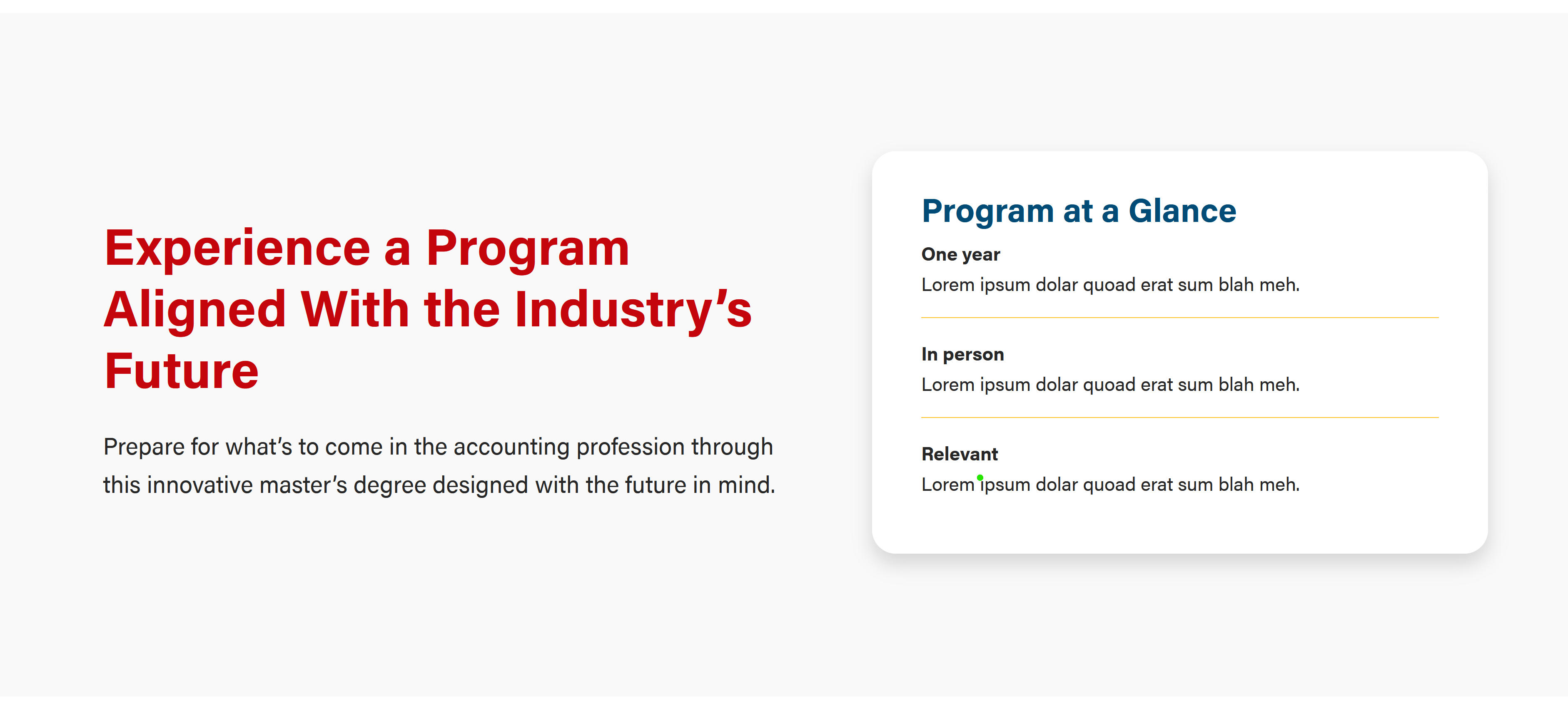
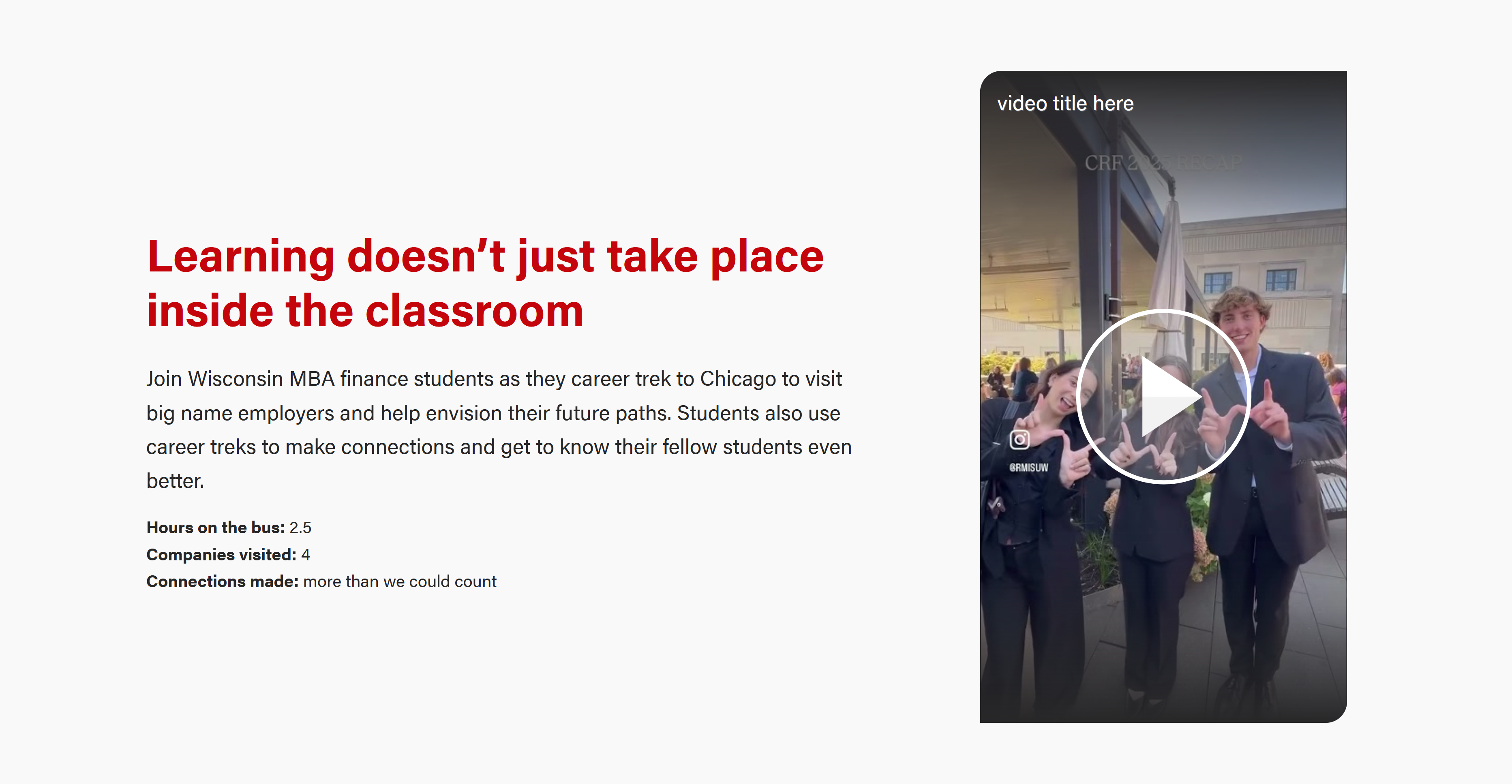
Mobile (stacked*)

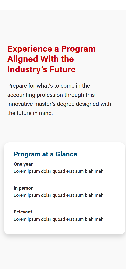
*6/5/26 future enhancement suggestion: add code to card component where the margin above it is optional (the spacing looks a bit big currently)
...
- Add WP Group block. Option to add a background color. Add If using a background color, add class "py-5" to the Additional CSS Classes field so there is top and bottom spacing within the background color.
- Within Group block, add WP Columns block. In the right menu, set columns to two and make sure "stacked on mobile" is turned on.
- Set the % width of the individual columns. There is wiggle room based on how it looks, but use something around 60%/40% or 55%/45%.
- For the column on the left, add class "pe-lg-5" to the Additional CSS Classes field so there is spacing between the columns on large screens.
- Add the blocks you want to use within each column. Often a WP Heading and WP paragraph on the 60% side and then either a photo or a card on the 40% side.
...