
Also known as: people card
Description
A card that can display a person and their data, such as a short biography, position, email, LinkedIn profile.
| Expand | ||||
|---|---|---|---|---|
| ||||
|
Design
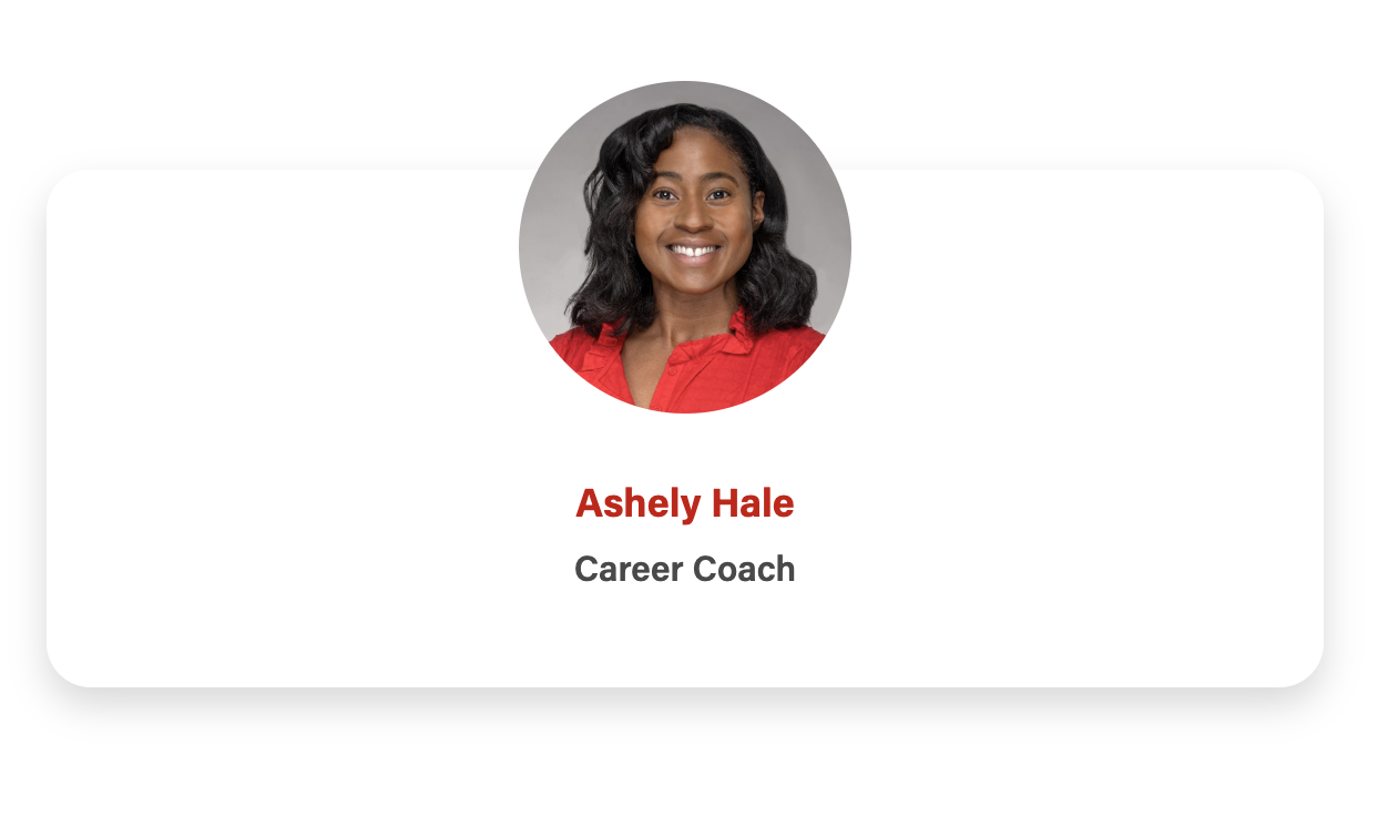
Card with no bio, intro text centered
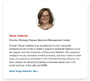
| Card with bio, text left-aligned
|
Card with CTA hidden and name linked instead
| Card with image overlap
|
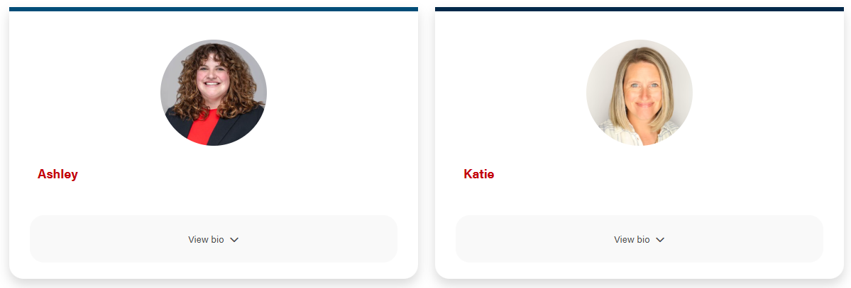
Card with border top
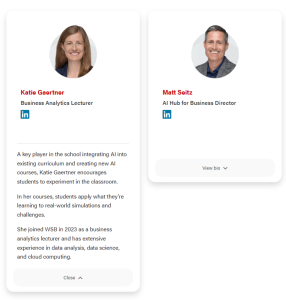
| Card with expanded
|


Use When
- Use when you need to add additional information, such as a biography, that isn't found in the directory data.
- This card has been used for displaying guest speakers on event posts and board members on webpages.
Editorial Guidelines
Follow our general Web Copy General Guidelines in addition to the following:
Design Assets Needed
Images
Card photo (required)
- Circle crop photo
- Square photo with face centered; use a headshot or another type of photo where the person is facing the camera
- Dimensions: 500x500px or 1000x1000px
- jpeg file
Implementation
ACF Fields
Add/Edit Cards
Name
- Add the name of the person.
Image
Use square images or stylized cutout headshots (also a square shape) available in the WP media library
Tip: When you go to insert the first image in the first card, insert all of the images you want at once, and a card for each image will be automatically created.
Crop image to circle
- Choose yes or no, default is yes. Choose no when using a stylized cutout headshot.
Design
Component Library
Link to figma doc with component if it exists
Screenshot
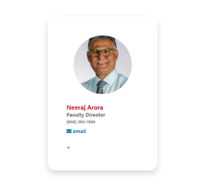

Use Cases
Use Case 1
A good component for Wekeil speakers and other profile pages.
Use Case 2
This a good block to use for Contact Us pages if they have a biography. The Sitecore Contact Us pages included an image, name, position, phone number, and email address.
Fields
Image
Use images available in WP
Name
...
Position
- The person's position goes here. Since you are manually entering the data, you can use their working title instead of their actual title from the directory.
Organization
- The person's department or company goes here. This field is added to the position line (Position, Organization).
Email Address
...
- Add the email of the person.
Phone Number
- Add the phone number of the person, e.i. 414-xxx-xxxx.
Other Supporting Detail
- This field appears above the email address
...
- . If there no other detail is needed, it's fine to leave empty.
Description
- Can use this field for social media icons to be added. You will need to add the following code.
The class="social-media-icon" must be added to the <a> tag for the styles to appear.Code Block title Social Media Icon code collapse true <a class="social-media-icon" href="person's social media link goes here" aria-label="Follow me on LinkedIn"><i class="fab fa-linkedin mt-1 mb-2" aria-hidden="true"></i></a>
Description
- Use for a biography or portfolio. If there is no biography, it's fine to leave empty.
Link
Multiple links can be added
...
*; link to the person's profile in the directory, LinkedIn profile, their presentation video, etc.
*Note: if using the "Hide CTA and link name?" field detailed below, only add one link to each card.
Introduction
- Add a heading and supporting copy above the cards.
Footer
- Add a footnote or button(s) below the block.
Configuration
Add border top color to the cards?
- Adds branded blue or dark blue to the top of the cards.
- Choose yes or no, default is no.
- Do not use with swiper option (card overflow is hidden, so the photos will get cut off). Only use with circle cropped images or stylized cut-out headshots.
Hide CTA and link Name instead?
- Choose yes or no, default is no.
- Use when the card link goes to a person's profile page, whether in the WSB directory, LinkedIn, etc. and the name makes sense as link text.
- Use sparingly. Make sure you have added exactly one item to the link field for each card.
Stretch Link
- Check to add hover effect to the card and make whole card clickable.
- Only use on cards that contain one link.
Block wrapper classes
Anchor Id
- Add an Id to target the block on the page with an anchor link
Enable swiper
- Choose yes or no, default is no.
- Creates a swiper layout, rather than the standard grid layout with columns and rows.
- 10 card limit for the swiper, due to the width of swiper control arrows on mobile.
- Note that this setting doesn't work with the standard column controls on this block. Rather, columns are fixed in the code for XS, S, M, and L viewports and you can set columns for XL screens with the next field.
Swiper Columns
- Choose how many cards/columns display on XL screens – 3 or 4 columns. See which option looks best with the card content, typically cards with more content look better in 3 columns.
- Choose yes or no, default is no.
- Setting this field to true will NOT center text in the main card body, as it is not recommended to center paragraphs of text. If you do need to center the main content, add "text-center" class to Block Wrapper Class(es). You will need to also set this field to yes if you want all text in the cards to be centered.
Show expanded content on cards?
- When checked, a button will appear on the card that will allow for a title and copy to be shown to the user when the user clicks on the the button.
- Hides Enable Swiper and Stretch link fields
- Don't use links in the card footer. If you need to add a link, place it in the card description WYSIWYG
Column Structure
...
The columns are automatically set at
Columns Default: 1
Columns Small: 0
Columns Medium: 3
Columns Large: 4
Columns Extra Large: 0
This is fine if there's no biography. If there is a biography, the columns Medium
...
should be set to 2
...
and Large set to 0.