...
This toggle is particularly useful if you want to style the same image in two different ways- you can just duplicate the image, and have one that is hidden in desktop, and one hidden in mobile.
Note: the screen size at which it swaps between mobile/desktop is 645px wide screen. This is different from the breakpoint for when columns stack, which is 480px.
But wait... shouldn't "hide in desktop/mobile" be in sync with columns stacking?
If you'd like the mobile version of your element to appear at screens that are sized 480px and less (when all the columns stack on top of each other), instead of 645px and less, here's the fix:
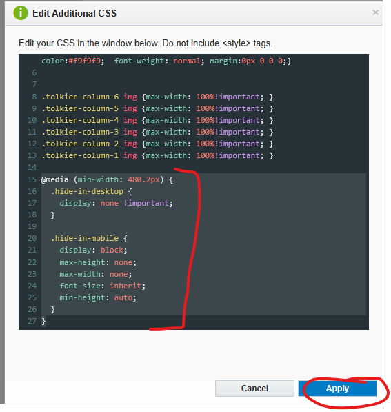
- Once you're done designing your email, go to the paintbrush icon in the left sidebar, and under "Advanced Styles" click the "Edit" button.
- Inside the additional CSS, paste in the following code, then click "Apply"
| Code Block | ||||||
|---|---|---|---|---|---|---|
| ||||||
@media (min-width: 480.2px) {
  .hide-in-desktop {
    display: none !important;
  }

  .hide-in-mobile {
    display: block;
    max-height: none;
    max-width: none;
    font-size: inherit;
    min-height: auto;
  }
}
|
| Expand | ||
|---|---|---|
| ||
|

The annoying drawback to this fix: once you've applied the code, all elements set to "Hide in Desktop" disappear from the Eloqua editor, and you will not be able to see them or edit them, even when you're in "mobile" view. It still works fine when you actually send your email (make sure to send test emails and check mobile sizes), but the way the CSS code gets applied in the editor isn't quite right.
To avoid this issue, make sure to wait to add this code until after you're completely done editing your email. You can also always delete the code and re-add it later if you need to make an adjustment.
Image Columns Overlap on Tablet Issue (Outlook)
...
The web team is working on implementing this fix on all templates starting in Dec 2025, but if your email doesn't have this built in, you can easily add a manual fix.
- Go to the paintbrush icon in the left sidebar, and under "Advanced Styles" click the "Edit" button.
- Inside the additional CSS, paste in the following code, then click "Apply"
| Code Block | ||||||
|---|---|---|---|---|---|---|
| ||||||
.tolkien-column-6 img {max-width: 100%!important; }
.tolkien-column-5 img {max-width: 100%!important; }
.tolkien-column-4 img {max-width: 100%!important; }
.tolkien-column-3 img {max-width: 100%!important; }
.tolkien-column-2 img {max-width: 100%!important; }
.tolkien-column-1 img {max-width: 100%!important; }
|
...
The only drawback with this fix is that any image in a column that uses the image scale to adjust the size, gets changed to take up the full width of the column instead of whatever size you scaled it to. So make sure to use "autofit" for your images inside columns half-width or less, or remove this css code if you don't need it (sometimes you have to make design compromises).