
-
Created by
 Sonia Villa, last updated by Kassandra Swearingen on Jul 10, 2026
2 minute read
Sonia Villa, last updated by Kassandra Swearingen on Jul 10, 2026
2 minute read
Component name
Also know as: rankings card, stats card
Design
The ranking block has two formats:
Standard
| Circles
|
|---|
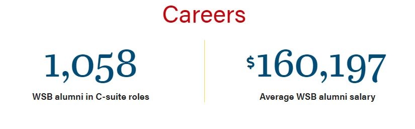
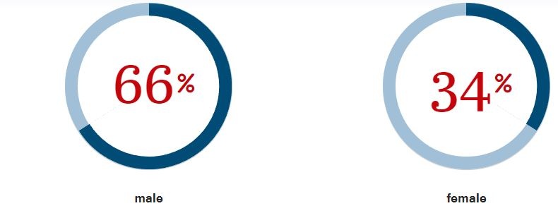
You can add a background color to the two formats:

Use When
You use this block when displaying rankings or statistics (ex: average salary).
Editorial Guidelines
Follow our general Web Copy General Guidelines in addition to the following:
Implementation
ACF Fields
Rankings
Number Prefix
- Use this field to pick a prefix if needed.
Number
- Add the number of the ranking.
Number Suffix
- Use this field to pick a suffix if needed.
Statistic
- Add copy elaborating on the ranking displayed.
Source
- You can add a source to cite the ranking.
Ranking with statistic and source:

Introduction
- Add a heading and supporting copy above the cards.
Footer
- Add a footnote or button(s) below the block.
Configuration
Number Color
- You can change the color of the numbers.
- The options are red, blue, and gray.
Rankings Style
- You can choose between the standard or circle style for rankings.
Background
- You can choose between white (none) or blue background of the block.
Stack Rankings
- Checking this box will switch slider to stacking the rankings.
Two Columns
- You will see this field if Stack Rankings is checked.
- Checking this field will have the rankings in 2 columns instead of 3 columns.
Anchor ID
- Add an Id to target the block on the page with an anchor link.
Additional Notes
- You can add more than three rankings in a row, but after three, the block will add a swiper at the bottom to swipe through rankings.
- Try to keep the copy as short as possible with multiple rankings.
- The width of this block (with no background color) is expanded in 4 Custom Post Types – Posts, Blogs, Update, and Spotlights. Find the code for this in _layout.scss