
...
| Expand | ||||
|---|---|---|---|---|
| ||||
|
Design
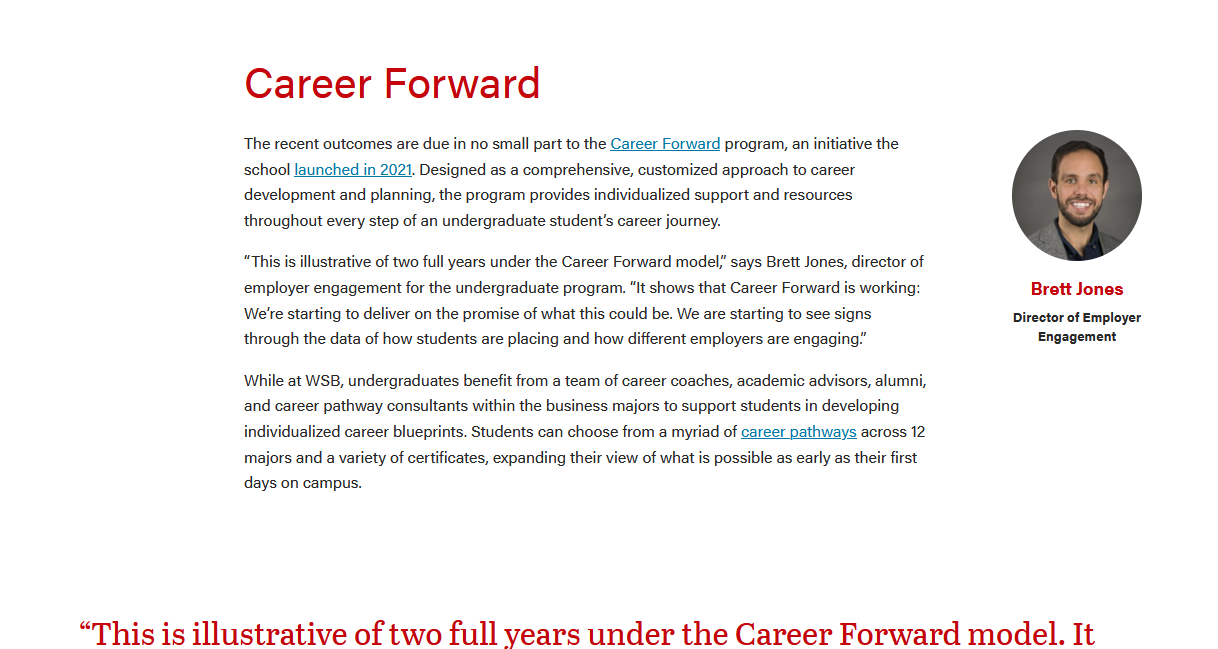
Person with photoDesktop view
Tablet and mobile views
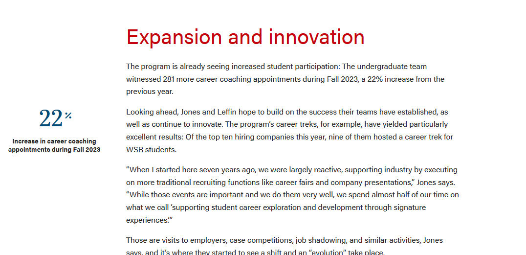
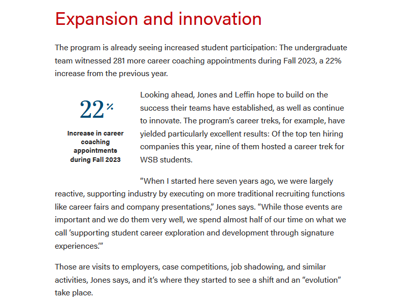
Source: A Banner Year: WSB Releases Employment Outcomes for Undergraduate Class of 2023 | Statistic/rankingDesktop view
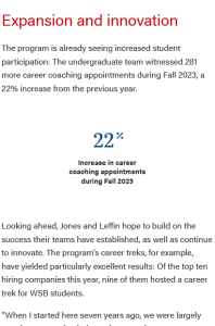
Tablet and mobile views
Source: A Banner Year: WSB Releases Employment Outcomes for Undergraduate Class of 2023 |
Text only |


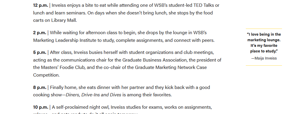
Text only with headline
|



Anatomy*
- *This will be a future addition - see Material Design example for cards
- A diagram with labels for each feature/atom
Use When
Use When
- Displaying sidenotes or other supplemental content
- Adding a ranking/statistic to an article
- Including the photo/name of someone mentioned in the article
Do not use when:
- There are already 3 asides in the article
- There is another aside within one paragraph
- Displaying a long chunk of text (more than 100 characters)
- Start bullets with gerunds for consistency; the bullet should complete the phrase starting with "Use when..."
- Example: "Displaying a small amount of copy with a photo"
(optional) Include a “Do Not Use When” subhead when needed
Editorial Guidelines
Follow our general Web Copy General Guidelines in addition to the following:
- 100 characters or less- keep copy as short as possible.
- This is total - including the heading, subtitle, and copy.
- Character limits for each feature with copy
- Notes about copy fields that should or should not be used together
- Tips for writing these guidelines
- Use bulleted lists
- Use affirmative language
- Limit to two sentences or less Edit and use fewer words!
Design Assets Needed
Images
...
1 photo (
...
optional)
- Dimensions:
- Other details to note (e.g. keep faces vertically centered)
Photo B (required/optional)
- Dimensions:
- Other details
Implementation
ACF Fields
Other technical details we include in existing docs
Resources
- Figma mockup (link)
Tips
- Aside blocks are meant to be used with a very small amount of copy. (~100 characters or fewer)
- Asides should be used sparingly in a single article.
- Use 3 asides max in one article.
- Photos/icons should be square. This component will crop images to a square or circle, depending on which layout is selected.
- If using more than one aside, they should be separated by at least one paragraph.
Avoid this:
...
- Any square image, typically 266x266px
- Note that for the Image - Person option, the component will add a circle crop.
Implementation
Anatomy / ACF Fields
When using the Aside, in most cases you don't want to use all the fields at the same time, as the content will get too long.
Type: Image Icon or Image Person
The only difference between Icon and Person is that the Image - Icon Type adds the yellow bars to the top and bottom.
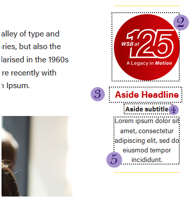
- Placement: Left or Right. Choose whether the aside is on the left on right side of the article.
- Visual (optional) - the photo for the aside. Note that the photo will automatically be cropped to a circle.
- Headline (optional)
- Subtitle (optional)
- Copy (optional)
Type: Ranking
This is a mini version of the Rankings block.
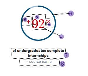
- Placement: Left or Right. Choose whether the aside is on the left on right side of the article.
- Number Prefix
- Number
- Number Suffix
- Number Color
- Rankings Style - Standard or Circle. Circle should only be used for percentages
- Statistic
- Source
Dev Notes
Please note that in the ACF field under Type, you will see statistic : Image - Icon, as it use to read statistic : Image - Statistic. I'm unable to change the first statistic as it will remove all the fields in the block in the editor. Also, In the SCSS file, Image - Icon field will be called callout-statistic.