
-
Created by
 Erica McConnaughey on Sept 13, 2024
4 minute read
Erica McConnaughey on Sept 13, 2024
4 minute read
Purpose
To highlight an audio snippet, or multiple audio snippets, with supporting content inside a card for each audio snippet.
Design
Component Library
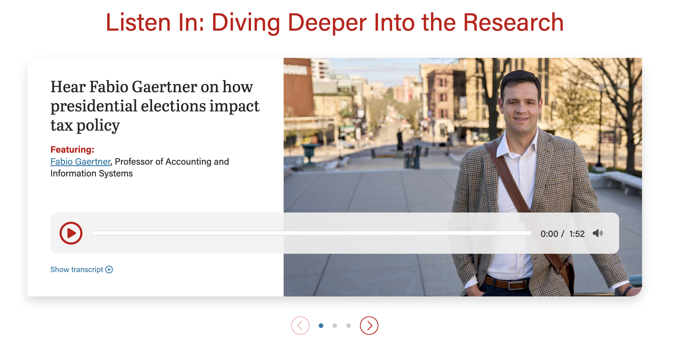
Wireframe - the audio player has a heading that starts "Listen In..."
Screenshots
Image 58% wide (with swiper arrows)
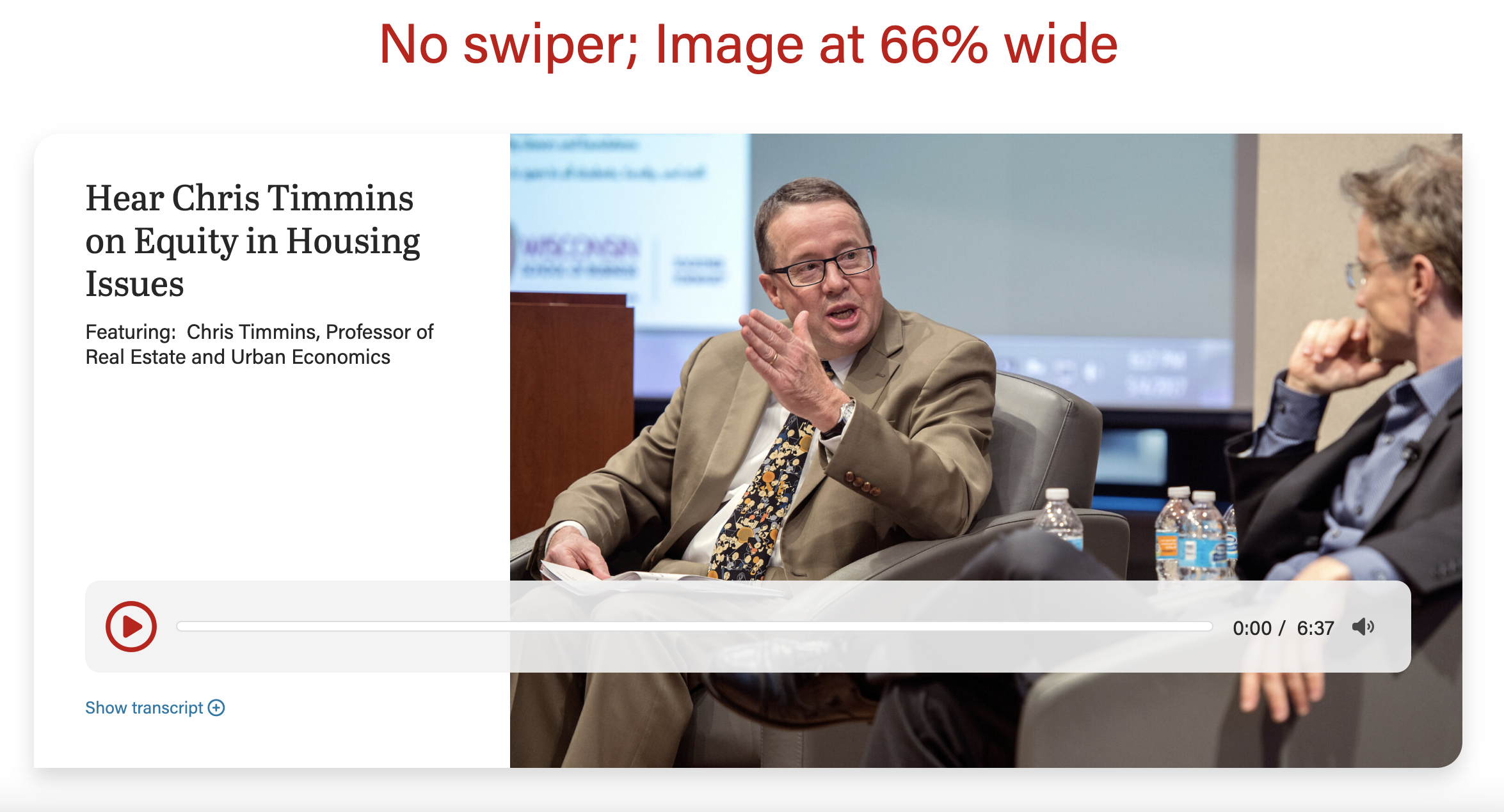
| Image 66% wide
|
|---|---|
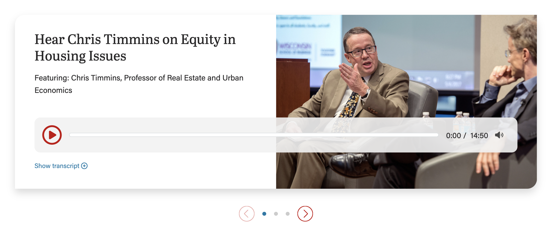
Image 50% wide (default; with swiper arrows)
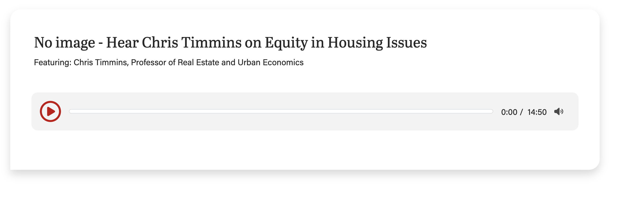
| No image
|
Use Cases
Use this block to embed an audio snippet with supporting content (heading, optional photo).
Use this block to embed multiple audio snippets, each in their own card.
Can be used on a Page or in a Post
Note about copy
Keep copy short inside the card when using an image for this block.
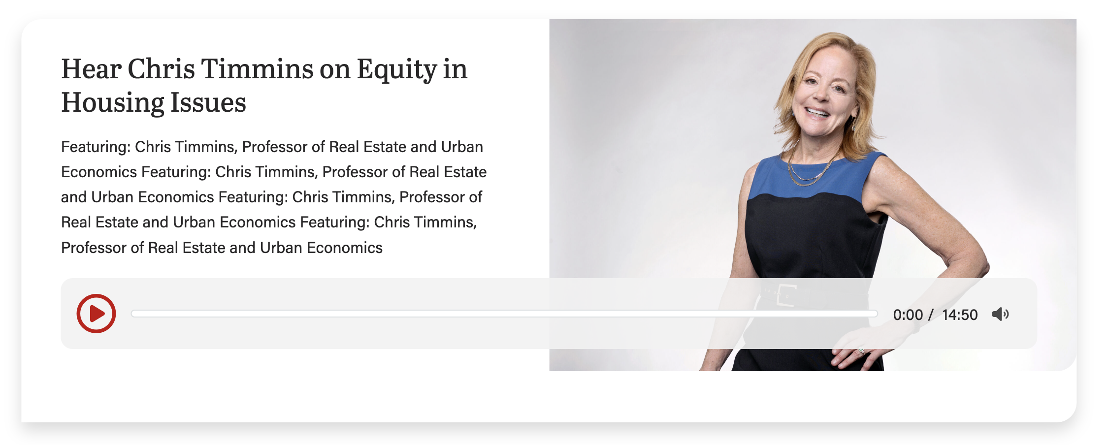
Too much copy will break the layout (the card will extend below the image), so test the block with the content in it at every breakpoint (screen size).
This screenshot shows the card with too much copy, causing the layout to break:
42/58 layout (use most often)
This layout can be used anytime you need an image next to copy.
To use this layout, choose 58% for Image column width field, under Configuration.
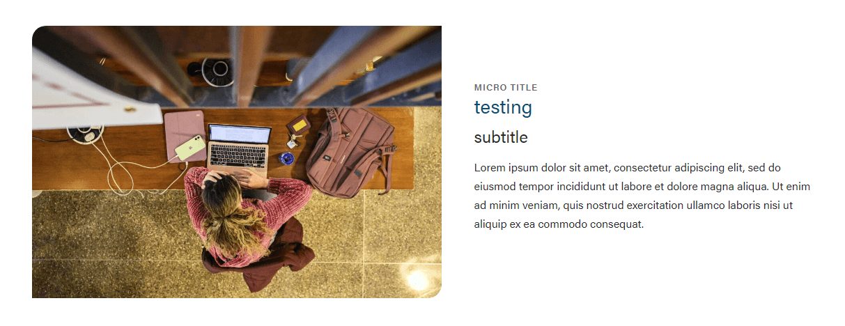
50/50 layout (default; use often)
This layout can be used anytime you need an image next to copy. You can use this layout when the image is not as important or does not have small details that are important to see.
This is the default layout of the block.
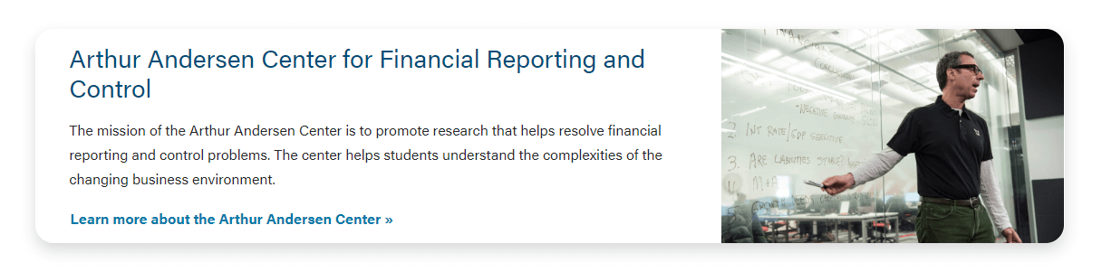
33/66 layout (use sparingly)
Only use this layout when you have a very small amount of copy (< 250 characters total).
To use this layout, choose 66% for Image column width field, under Configuration.
Card-level Fields
Audio (required)
Title
The card title. You can select the heading size in the card configuration.
Heading Size
You can select H2 - H4 heading sizes.
Subtitle
The card subtitle.
Image
Use large, high-quality images that are 2400 x 1600 or smaller.
Image Alignment
The image can be on the left or right side of the page.
Micro title
The card micro title.
Content
The supporting copy. This should not be more than 1 paragraph or 4 sentences. Make sure the amount of copy in the card looks good. If not, cut some of it or ask a writer to cut some of it.
Link
The URL.
CTA Styles
You can pick text link or different CTA styles for the link.
Block-level Fields
Stretch Link
The text will become stretched and has the raised hover effect. In addition, the title will become the link location with an outline effect when tabbed.
- This should only be used when the card is displaying an outline and shadow (i.e. 33/66 layout or 50/50 layout with Overlap Text ON).
- For right now, this field is to be used for Update Magazine.
Overlap Text
The text will have a shadow and overlap the image. NOTE: Only use with the 50/50 layout.
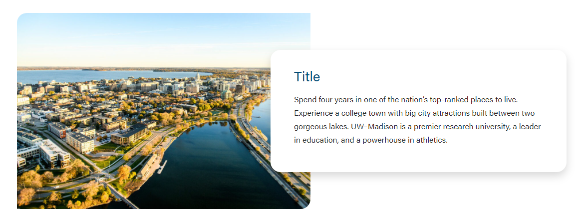
Image Width
You can select the following sizes.
33/66
50/50
Enable Swiper
If you have multiple cards in one block, you can choose between using a swiper or stacked the cards on the page.