
-
Created by
 Erica McConnaughey, last updated on Aug 21, 2026
3 minute read
Erica McConnaughey, last updated on Aug 21, 2026
3 minute read
Also known as: Sidebar, Endbar, Aside
Description
A box for displaying extra content at the end of a news or blog post.
Design
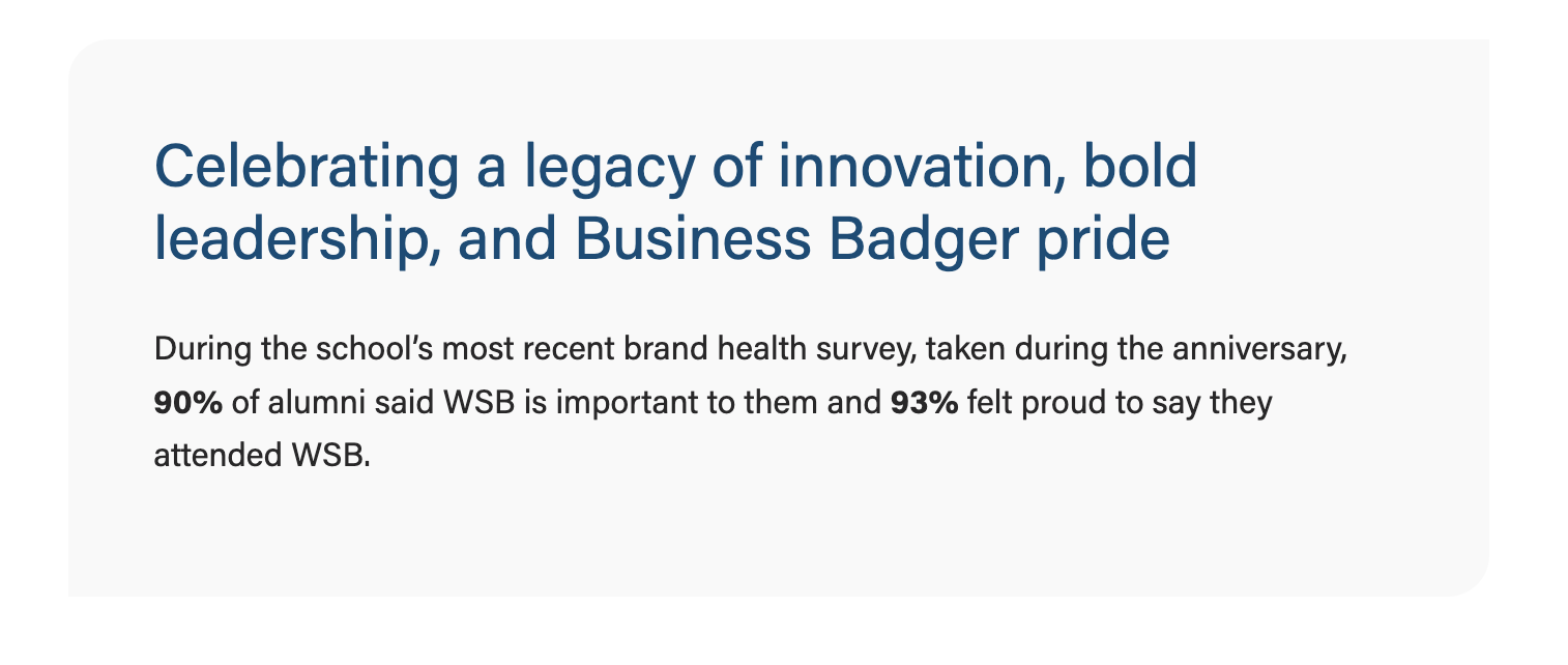
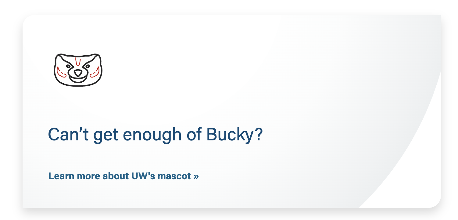
Use When
- Displaying a small amount of sidebar content for a news, Update magazine, or blog post
- We recommend using this block once per post, at the very end.
Editorial Guidelines
Follow our general Web Copy General Guidelines in addition to the following:
Heading (recommended)
- A heading is recommended here to make this content accessible and easier to scan.
- Leave the heading size at an h2, unless you are nesting this block under another heading on the page.
Supporting copy
- Length: 3 short paragraphs max
Button (optional)
- Keep button copy short, while still providing enough context that the user can figure out what the link is for without reading all the content in your callout.
- Examples: "Read more about XX" or "Register for the workshop"
- Avoid saying "Click here" or "Register here"
Design Assets Needed
Images
Photo or icon (optional)
- Photo - 2 options
- Rectangular photo
- File type: jpg
- Dimensions: 700x400px (you can use our standard image ratio/size of 16:9 or 2400x1600px)
- Square headshot (will be cropped to a circle on the webpage)
- File type: jpg
- Dimensions: 300x300px
- Keep faces centered, with space on all sides so nothing important gets cropped out
- Rectangular photo
- Icon
- File type: svg
- The svg icon will be displayed with a height of 100px.
Implementation
ACF Fields
- Options: gray (default), light blue, or gray pattern.
- Note: our brand blue color was lightened to meet color contrast standards with text and button copy
Image
- This can be a rectangular photo, square headshot, or svg icon.
- Note: This block treats all images with .svg extension as an icon and displays them at a smaller size to match the icon sizes across the website. If your chosen image is not an icon and you'd like it to be displayed larger, convert it to .jpg or .png file format.
- Conditional fields:
- Crop image to circle? Toggle to Yes only when using a square headshot.
- Center image? Toggle to Yes if desired; if set to No, image will be left aligned.
Heading
- Add your heading text
- Conditional fields:
- Heading size – select the appropriate heading size (h2, h3, h4, h5)
- Heading alignment – choose left (default) or center
Text
- Add your supporting copy. All content in this field will be enclosed in <p> elements.
Button
- Add URL and button copy
- The button is styled by the .btn-link class
- Note: the standard .btn-link color and hover color were darkened to meet color contrast standards
- Conditional fields:
- Button Alignment - choose left (default) or center
Additional Notes
- This block is intentionally kept simple so that writers and other non-technical folks who work on News and Blog posts can use it easily.