
-
Created by
 Erica McConnaughey, last updated on Jul 09, 2026
4 minute read
Erica McConnaughey, last updated on Jul 09, 2026
4 minute read
Also known as: sound bite, audio clip, podcast player, media player
Description
Plays an audio clip, or multiple audio clips, while also displaying supporting content, a transcript, and an optional photo for each clip.
Design
|

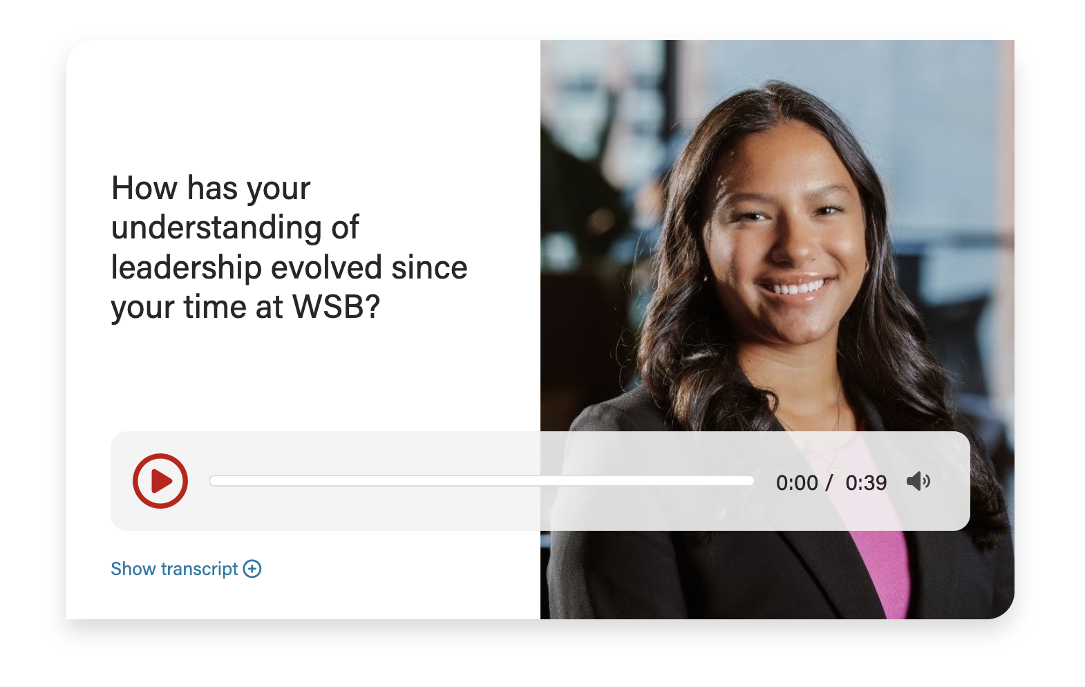
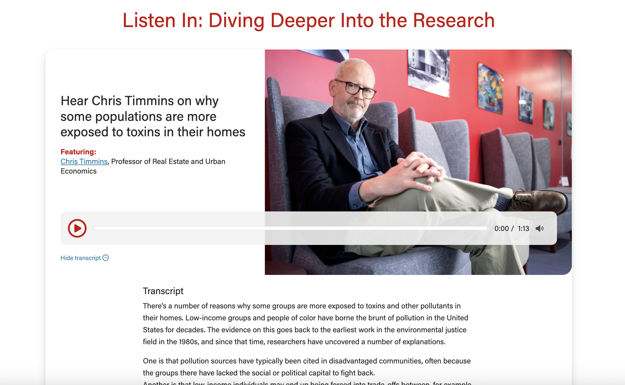
Use When
- Embedding one or more audio clips onto a webpage, news story, or blog post.
Editorial Guidelines
Follow our general Web Copy General Guidelines in addition to the following:
- Can only use up to 3 of these fields at a time:
- Microtitle (optional)
- Very short (30 characters or up to 4 words)
- Displays a category/topic to give context
- Heading/title (required)
- Typically an h3 heading
- Subtitle (optional)
- Rarely used
- Supporting content (optional)
- Often used to highlight key people featured in the audio clip
- Link text (optional)
- Typically used to link to the full podcast episode for the clip
- Microtitle (optional)
- Transcript (required)
- This is an accessibility requirement
- Should be edited for clarity (remove stutters, repeated words, etc.)
- Include speaker names if more than one person is featured in the clip.
- See AI Hub for Business for an example of this
Important!
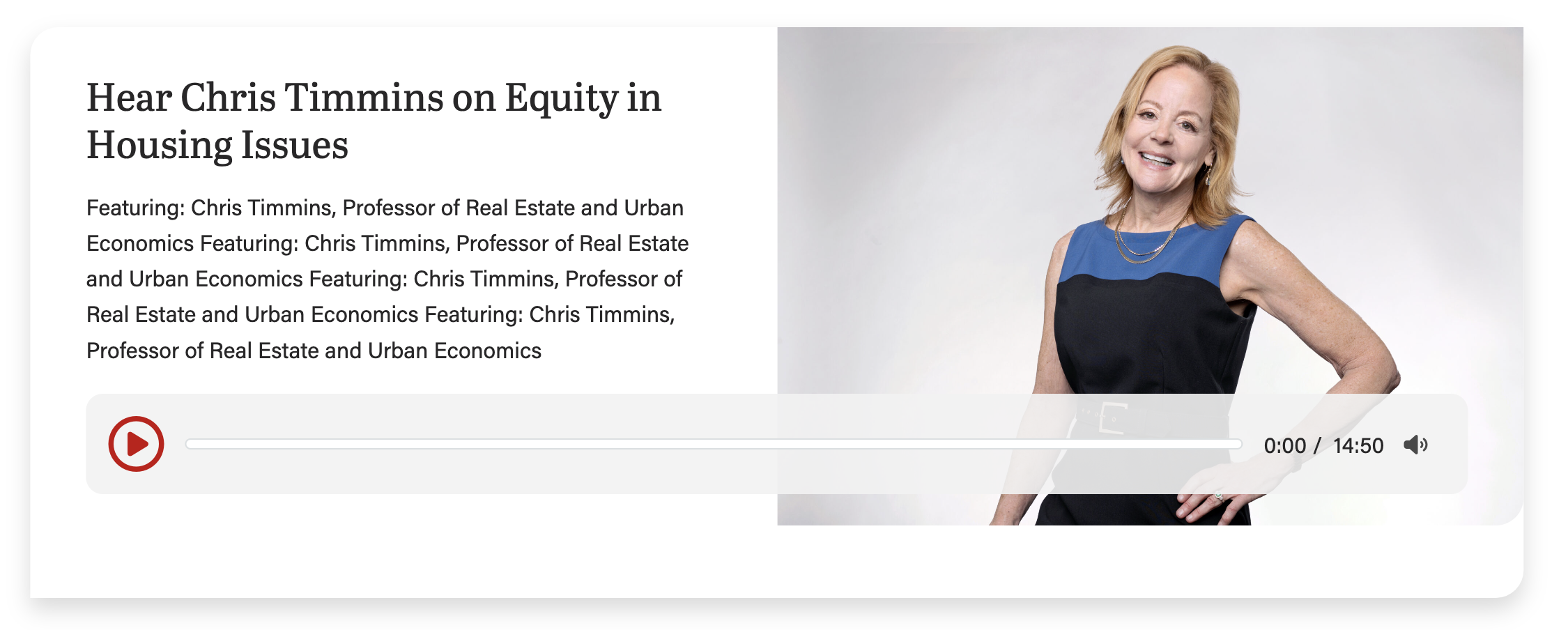
Keep copy short inside the card when using an image for this block.
Too much copy will break the layout (the card will extend below the image), so test the block with the content in it at every breakpoint.
This screenshot shows the card with too much copy, causing the layout to break:
42/58 layout (use most often)
This layout can be used anytime you need an image next to copy.
To use this layout, choose 58% for Image column width field, under Configuration.
50/50 layout (default; use often)
This layout can be used anytime you need an image next to copy. You can use this layout when the image is not as important or does not have small details that are important to see.
This is the default layout of the block.
33/66 layout (use sparingly)
Only use this layout when you have a very small amount of copy (< 250 characters total).
To use this layout, choose 66% for Image column width field, under Configuration.
Card-level Fields
Audio (required for each card)
Upload or use an audio file from the media library. Only MP3, WAV, and OGG files are supported.
Title
The card title.
Heading Size
You can select H2 - H4 heading sizes.
Subtitle
The card subtitle.
Image
Use large, high-quality images that are 2400 x 1600px. Using a shorter image may break the layout by causing the card to extend below the image (see callout above).
- You can try using taller images. Example: This news story from 2025 uses a custom-cropped photo that is 2400x2817px
Micro title
The card micro title.
Content
The supporting copy. This should not be more than 1 sentence. Make sure the amount of copy in the card looks good. If not, cut some of it or ask a writer to cut some of it.
Transcript (required)
The audio transcript. Required for accessibility. Causes a "Show transcript" link to appear at base of the card.
Link (use sparingly)
The URL. Use sparingly as it will distract users from the primary action for this block, which is to play the audio snippet.
CTA Styles
You can pick text link or different CTA styles for the link.
Block-level Fields
Image Column Width
Default is 50%. Can also choose 58% or 66% for image width.
Enable Swiper
If you have multiple cards in one block, you can choose between using a swiper or stacking the cards on the page.
Potential future updates for this block
- Consider adding keyboard arrow controls for swiper slides, as long as it doesn't interfere with arrow actions for the audio controls (e.g. scrubbing and volume control).
- When the swiper slide is changed, set focus on first focusable element in the now active slide (Erica tried to do this when creating the block, but it created other problems with the swiper code)
- Crosscheck onKeyDown keycodes with vertical tabbed block code, since we used a different, newer way of checking which key was pressed.